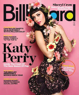
In this lesson, you will create a flat plan for the front cover of your magazine and your double page spread. Think of it as a rough rough rough draft. That's right, you're making a draft today, by the end of the lesson!
Before you do these, open up at least three examples of each in the tabs of your browser. Pick magazine covers you really like. These will be your guides.
I don't know what I'm doing. What should my magazine look like?
For this project, you will be marked on conventions. While you will be given considerable creative freedom in your magazine project, it is absolutely essential that your magazine looks, reads and feels like a magazine!
This lesson will help you to deal with the basics, and then you can spend time working on constructing a compelling and subversive celebrity seeking to target a niche audience.
Length: 3 pages.
Front cover:
Double page article:
Using pens and A3 paper, create a rough flat plan/draft of the front cover and double page spread.
The minimum expected elements for the magazine project
Length: 3 pages.
Front cover:
- Original title and masthead for the magazine; strapline
- Cover price and barcode
- Main cover image to establish the identity of the new artist or band
- Main cover line relating to the new artist or band plus at least 2 further cover lines
Double page article:
- Feature article (approximately 300 words) to promote the new artist or band. The article should include an interview with the artist or band.
- Headline and stand-first, sub-headings, columns
- One main image and at least 2 smaller/minor images (all original and different from the images on the cover)
- Pull quotes and/ or sidebar
Analyzing existing magazines
Choose two front covers and two double page spreads of any magazine. If in doubt, please choose from the examples below. Make a list of all the conventions of these magazines, how they are used, and where they are found. You will be emulating these conventions to make your magazine as conventional as possible.
Remember that you will not find every convention listed on these magazine covers.
A rough rough rough draft: creating a flat plan
Using pens and A3 paper, create a rough flat plan/draft of the front cover and double page spread.
For more info on how to produce a flat plan, including an example of what we're looking for, click here.
Before you do these, open up at least three examples of each in the tabs of your browser. Pick magazine covers you really like. These will be your guides.
I don't know what I'm doing. What should my magazine look like?
What shot types should I use?
Where does this or that go?
What colours do I use?
How big should the masthead be?
How many cover lines should I use?
How much should my magazine be?
[literally any other question]?
The answer to all of these is look at the examples of magazines you have picked
For example, if you're thinking of putting the masthead at the bottom of the front cover, check out your guides first. Do any other magazines do this? Why not? When you're working out how much space your model should take up in relation to the other elements, look at your guide, and try to do something as similar as possible.
Magazines tend to follow an extremely conventional approach to construction. You should follow this approach as closely as possible, and let your use of hair, costume, makeup and colour show your creativity and the ideological perspective of your artist.


