Friday 27 September 2024

The language of semiotics

Semiotics is the study of meaning. Semiotic analysis or deconstruction is where a student breaks down a media product to work out it's deeper meaning.

One issue with this is that it's very possible to just 'go off on one' and have a bit of a rant. We all have opinions on the deeper meaning of things, and online forums are absolutely stuffed with fans theorising over the meanings of their favorite products. 

What Barthes and other semioticians attempted to introduce to the discipline was a unifying structure and language of analysis. This enabled semioticians to precisely pull meaning from media products. The language is often complex-sounding and rather fearsome. Yet ultimately, semiotics is about how meaning is created. It just uses the right words.

COOL FACT - Roland Barthes wasn't the only semiotician. Far from it! Other named theorists we study in media studies who absolutely rely on and expand upon semiotics include Levi-Strauss, Baudrillard and Hall. Therefore, an excellent analysis will use the language of many of these theorists, spliced together. 

Below is a selection of words related to semiotics and post-structuralist deconstruction that will help you make your answers more precise and confident to boot. 


Semiotic analysis allows us to make sense of the world around us. Even mundane situations can be filled with colour, lexis, fonts, costume codes and layouts that construct a vast array of meanings


Semiotic analysis keywords

This is a list in progress. If you spot any 'big media words' that you love, then let us know!

Connote - a suggestion of the deeper meaning

Signify - again a suggestion of a deeper meaning, a level below the sign

Constructs - to build meaning

Designates - to assign meaning

Anchor - to 'weigh down' meaning, or to 'fix' meaning. A perfect example is a caption

Myth - a recurring story that keeps arising in societal contexts, for example 'the American dream' or 'the structures of democracy'

Mytheme - a single element of a myth, for example 'st George slays the dragon' or 'Aladdin finds the magic lamp' or 'losing everything before fortunes change'

Encode - to build or 'put meaning in to something' 

Narrative codes - anything related to telling or furthering a story. For example an intertitle with the time and date functions as a narrative code, clearly indicating the passage of time to the audience. A fade to black or other transition can do the same thing

Visual codes - anything the audience can see that creates meaning. This is very broad, but a red dress may encode a sense of glamour and romance

Technical code - the ways in which a media product is constructed that construct meaning. For example, the use of rapid fire editing connotes a sense of urgency and hostility

Gesture code - things subjects do with their bodies or faces that construct meaning. Therefore, the gesture code of a beckoning finger may directly address the audience, and position them discretely within the world of the narrative

Genre code - the elements that construct genre. For example, knives, masks and blood are genre codes of the slasher film. This term is broadly synonymous with genre conventions

Symbolic codes - Something that suggests a deeper meaning. A middle-aged character situated in the MES of a powerful sport's car may symbolically represent a mid-life crisis

Proairetic code - Something that suggests that something is going to happen. For example, a shock zoom could suggest a sudden and surprising event

Hermenutic code - Something that asks a question or constructs a mystery. For example the MES of a knife sticking out of a corpse's back will encourage the audience to decode the mystery as to who killed them...

Cultural code - where a specific culture is made reference to in a media product. For example Top Boy constructs a hyperreal representation of black, urban criminal culture, and Silent Witness constructs a hyperreal representation of white, middle class law-enforcement culture. The audience's knowledge and expectations of these will affect their interpretation

Referential codes/intertextuality - where one media product makes reference to another media product. This can be for reasons of comedy and satire. Also it can simply be a narrative shortcut. For example, the huge wooden gates in Jurassic Park are a clear reference to King Kong, which also proairetically suggests the awful things that are about to happen...

Naturalisation - where a code is repeated over time until it becomes seen as being 'normal'. For example the idea that people with a facial scar are evil, that pretty people are the main character, that rain is depressing and that a big pair of glasses makes someone a massive nerd

Cultivated -  

Message reduction - 

Implosion - 

Paradigmatic feature - an element that suggests genre. Another way of saying 'genre convention', but fancy

Structure - How a media product is put together

Fetishisation - where a person or object is presented in an obsessive manner. Fetishisation is often sexual, but it does not have to be. For example, in Mad Max Fury Road, water is fetishised and used as a system of control. In The Wolf Of Wall Street, money is fetishised to a significant level, and is often conflated with sex...

Modes of address - how a media product 'talks' to it's audience. For example, using smaller font and fewer pictures in a magazine will address the audience in a sophisticated manner 

Diegetically situated - diegesis is the world of the narrative. So if something is diegetically situated, it means it exists in the world of the narrative. Examples include gunshot sound effects, props, costumes... anything the characters within the narrative could see or hear

Positioning - how the audience are 'placed' by the producer. For example, romantic comedies will often position the female middle-aged target audience with the female main character

Alignment - where the audience are positioned in such a way as to agree with the ideology of a media product. This is a complex technique that involves positioning, anchorage and so on. 

Deconstruct - to break down a media product to work out it's meaning

Wednesday 25 September 2024

Exploring diametric oppositions in the audiovisual spot advertisement for L'interdit by Givenchy


This post is an analysis of the video advertisement for L'Interdit. Click here to check it out!


How do diametric oppositions construct meanings in the advertisement for L’interdit by Givenchy?


  • The use of warm and cold colours, anchored through both high and low key lighting, constructs an opposition between a safe and comforting environment, and a dangerous yet also exciting atmosphere 
  • Furthermore a diametric opposition is constructed between wealth and poverty. The model’s costume is elegant, sleek and fashion forward. However, rather than remaining in her exclusive private party, the model enters a public transport hub (the Paris Metro). Additionally, the elegance of her costume contrasts enormously with the danger of the location she entering. The various shady characters directly address both the model and the audience, and position us in an uncomfortable mode of address. This is significantly anchored through the use of low key lighting, which symbolizes mystery and threat. However, the sense of threat and danger forms a binary opposition with the welcoming faces of the partygoers, and their their physical attractiveness. 
  • The spacious and distant nature of the house party, along with the cold and empty streets stands opposed to the stuffy, cramped, hot tunnels underground. This sense of hot is anchored through the use of warm colours. 
  • Finally, light and dark also form a complex opposition. The adverts keeps alternating between light and dark, but also natural and artificial light.  
  • A contrast is constructed between the soft, low key natural lighting of the apartment, and the harsh, in your face, unnatural lighting of the Paris Metro. Additionally, there is a notable shift between the above ground streets of Paris, and the underground of the metro. This sudden shift of tone symbolizes the model becoming more extroverted and more comfortable with herself 
  • The advert begins with an upbeat classical arpeggio, which slowly shifts into a more aggressive electronic kind of club music. By shifting from classical music to upbeat modern music, once more it is suggested that the model has found confidence 
  • The model’s high end and fancy dress forms a binary opposition with the dirty wet streets of Paris. Furthermore, we cut from a CU of the model’s face to a troubling POV shot from the window of a car, constructing a voyeuristic mode of address. By referencing the conventions of the horror film, the Givenchy advert constructs a binary opposition between a threatening horror narrative and a luxury perfume

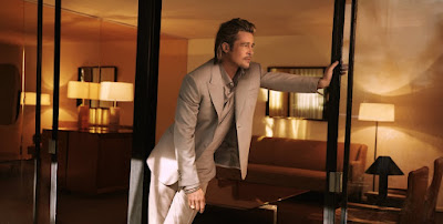
Textual analysis - Brad Pitt in Brioni


  • The cream coloured suit being worn by the model contrasts significantly wit the warm, reddish background colours constructing and reinforcing the importance of the model 
  • The lighting is soft and low key, and presents a honey coloured colour pallet, which creates a smooth and welcoming mode of address 
  • The MES of the model’s jewellery connotes both wealth and success. The boldness and largeness of his sovereign ring is the opposite of subtle, and situates the model as a confident, successful individual. 
  • The jewellery is understated, and fits in with the colour palette of the rest of the image, constructing Pitt as both fashionable and down to earth. 
  • The notion of Pitt being effortlessly fashionable is further anchored through his laidback body language, leaning effortlessly into a wall. Furthermore, the MES of his undone buttons connotes a laid back attitude 
  • Outfit contrasts with background/setting, constructing a sense of the model standing out and being the main focus of the image
  • The font of Brioni is sophisticated, elegant and even desirable, and suggests it’s expensive nature will appeal to a posh audience 
  • The position of the model’s hand connotes confidence, and suggests that the model is a confident person 
  • The MES of the advert constructs a sense of simplicity and formality. It suggests not only classiness, but also hints at the expense of the suit
  • The jewelry of the model is significant and easily noticeable, and clearly connotes the material wealth of the model. Therefore Brioni as a brand is clearly associated with appearance
  • It is not immediately clear what the advert is selling, which assumes that the audience is aware of the brand and their produce. This is typical of high end fashion adverts 
  • The advert completely lacks any reference to price, which suggests that the advert is targeting a high end, high income target audience. There is an implicit assumption about the quality and the price of the product, and like much high end fashion, the advert operates on on the idea that ‘if you have to ask, you can’t afford it’ 
  • The advert is set in a home, and the MES is overwhelmingly fancy, suggesting the target audience are rich
  • The MES of the model’s hair is well manicured, and suggests style and status. It is not a practical haircut, and being neatly held up, suggests Pitt’s upper middle class status. By being swept back, it demonstrates confidence and emphasizes his face. 
  • Pitt is a classic metrosexual, a heterosexual man who clearly takes care of his body and appearance 

Tuesday 24 September 2024

Introduction to newspaper magazines and examples of newspaper magazine double page spreads

What are newspaper magazines?

Newspaper magazines target a very specific niche in a tried and tested manner. What are some of the generic conventions of the newspaper magazine? How do they target their audience effectively? And who are they even targeting?

  • Conventional use of headings and subheadings allows the producer to convey the message or ideology in a simple and straightforward 
  • Pull quotes are used to highlight important aspects of the interview, suggesting the target audience lead busy lifestyles. Pull quotes also function as proairetic codes, inviting the target audience in
  • The lexis is sophisticated, reasonably complex and specifically targets a middle-aged and middle class target audience
  • Models and interviewees are often middle class and potentially midget. The main image of Sally Rooney features a stereotypically middle class coded dress, that clearly would appeal to the middle aged target demographic
  • The use of models is often aspirational to a middle class target audience, and constructs a glamorous and fashionable lifestyle 
  • Articles are typically written by journalists, and also typically construct a somewhat complex narrative. This is highly conventional of Sunday supplement magazines 
  • Typically, they cover a wide range of topics, including interviews and information about celebrities. However they tend to avoid scandalous gossip and rumours
  • They tend to target a specific audience. Middle aged, middle class and living a comfortable lifestyle
  • Sell an aspirational lifestyle 
  • A range of hegemonically attractive women are used throughout the article, functioning as a source of aspiration for the target audience 
  • A sophisticated lexis is employed throughout. Examples of sophisticated words and phrases “I found social life completely mystifying” and terms like 'euphemism’ 
  • Articles typically will construct an often complex narrative to the audience. Often, the journalist will take the role of the narrator, and will insert themselves into the story 
  • A sophisticated style that leaves much to audience interpretation
  • A simple and straightforward colour scheme often favours a single colour, for example blue. Classy and sophisticated!
  • Font selection is straightforward yet sophisticated. Subtle, serif fonts are used 
  • The MES of costume often reinforces and suggests a middle class audiences 
  • Use of a large, main image, anchored by several smaller images 
  • Fashion articles often employ an edgy, grainy, flash saturated aesthetic, constructs a nostalgic and aspirational mode of address
  • A big emphasis on writing, suggests a more sophisticated audience with time on their hands 
  • The layout is simple, straightforward, neat, sophisticated, which suggests a middle of the road, straightforward, and particularly large audience


Brief

We very, VERY strongly recommend that you use the style and format of a British BROADSHEET newspaper, and therefore focus on higher production values and an older, middle class target audience.

You are NOT making a magazine double page spread, you are making a NEWSPAPER MAGAZINE double page spread. What this means, in practice, is a clean, simple, straightforward layout with high quality images and an interview feature that constructs a compelling narrative. Please use the below examples to construct your layout.


  • Double-page feature article from a new British newspaper’s weekend supplement (or extract from a longer article):
  • Headline and stand-first
  • Feature article (approximately 200 words) on the artist or band’s attempting to ‘break into’ another country
  • An interview with the artist or band
  • Column layout appropriate for a newspaper’s weekend supplement
  • One main image and additional smaller/minor images (all original and different from the images on the poster); these may include photographs of the artist/band on the music video set, but ‘stills’ from the music video must not be used
  • At least one pull-quotation
  • A running header and page numbers

Examples of British newspaper magazine double page spreads and interviews

Check out this huge .pdf resource of excellent, high quality magazine double page spreads! Thanks so much Naamah!

Here's a few more from various Times on Sunday supplements, all published Sunday 22nd September 2024


Friday 20 September 2024

KA5 mock exam 2024


The KA5 mock exam is the first mock exam of your second year. It's designed to evaluate everything you learned over the first year. Perhaps more importantly, it's the final opportunity for teachers to assess you before submitting your final UCAS predicted grade. 

Due to the nature of the component one exam (which is what you spent the whole of first year preparing for!), we cannot tell you what is coming up. However, we can tell you the following:

The exam will be structured as follows

•             One 15 mark/30 minute unseen media language question. Anything could come up for this, print or video, you will have never seen it before, and you will have no way of knowing what it is. 

•             Two audience questions, adding up to 20 marks/20 minutes. Two of the following industries will come up: advertising, newspapers, radio, videogames. 

•             Two very short ‘define the industry key term’ questions. 4 marks/4 minutes total

Total length: 54 minutes

The KA5 week will NOT be collapsed, so the timetable will be normal, and the exam will be taken in lesson.

Thursday 19 September 2024

Applying semiotic theory to high end fashion advertising

Roland Barthes and semiotic theory - 'the symphony of codes'

The Ely Sinfonia. Orchestral music works by lots of instruments coming together to produce a harmonious sound. Barthes argued that media products worked in the same way, with musicians replaced with codes.


  • Barthes argued that media products communicate a complex series of meanings to their audiences through a range of visual codes and technical codes. 
  • A code is anything that means something. It could be a costume, a colour, a facial expression, a shot type; anything.
  • Barthes suggested a number of different code functions, that themselves combine to construct meaning.  For example, we have the proairetic, symbolic, hermeneutic, referential, and so on.
  • After many years of codes being repeated, their meaning can become generally agreed upon by society. For example, a scar on the face of a character can function as a hermeneutic code, indicating to the audience that they are ‘the villain’.

Barthesian codes 

Codes refer to any element of media language that creates meaning for the audience. Here are three of the most important examples

Hermeneutic codes

Also known as enigma codes, these refer to something within the media product that creates mystery or suspense

Proairetic codes

Also known as action codes, this refers to something within a media product that suggests that something will happen

Symbolic codes

Something within a media product that creates a deeper meaning for the audience

Task - analyse the promotional image at the top of this post, making explicit reference to both media language and Barthes' symphony


  • The beach is a model, which is symbolic of being fake. Yet is also constructs a perfect, delightful beach scene. By association, this idea of flawless perfection can be ap[plied to Gucci.
  • The MES of the model’s smile is connotative of her confidence and happiness. The model’s enormous size provides anchorage here, and constructed a sense of superiority and confidence. The model’s confident pose functions as a proairetic code, and suggests that she is headed to the beach . 
  • The MES of the graphic logo on the model’s swimsuit functions as a symbolic code. The representation of a palm tree symbolises holidays, the West coast of America, and luxury. By including the logo so prominently, Gucci are explicitly promoting their brand and associating it with all the positive vibes.
  • The colour palette is dominated by warm colours, and is connotative of sunsets and luxury, and reinforces the idea that Gucci is a luxury brand 
  • The sheer size of the model constructs a powerful hermeneutic code, and asks the audience why she is so big. The sight of a huge woman ‘attacking’ a miniature city makes reference to vintage monster films from the early days of cinema, and constructs a nostalgic mode of address. The fakeness of the town creates a contrast with the explicit reality of the woman, and suggests the the quality of the product. 
  • The tie dye colour scheme is symbolic of the 1980s, and the positive colours suggest that the world itself revolves around Gucci. 


Gucci Lunar New Year campaign 2022


  • The model is lying in a relaxed manner. Her composure is anchored through her facial expression, which seems to lack any emotion. Her expressionless face functions as a proairetic code, and suggests that the model will have a relaxing evening lying on the sofa. 
  • The model’s expression is polysemic, and also functions as an hermeneutic code, asking the audience why she seems to lack any emotion. However, the audience will also be confused as to the mise en scene of the enormous tiger lying at her feed. This combination of codes constructs a sense of confidence, relaxation, and control. By extension, the advert symbolically infers that Gucci is a powerful brand worn by powerful people. 
  • The tiger itself is symbolic of exoticism, power and foreign countries. This sense of exoticism is anchored and emphasised through the heavy use of silk, a material associated with wealth and east asian nations. The archetecture is also reminiscent of east asian classical archetecture. Finally, the ethnicity of the model is used to symbolise a sense of East Asian culture, and is clearly an attempt by Gucci to target Chinese audience
  • The golden colours symbolise a fiery personality, while the colour blue symbolises calm. However the colours of the setting itself is drab and uninteresting… or is is symbolic of gold and material wealth? It anchors the notion that the model is rich and powerful.
  • There are many complex patterns that threaten to odminate the image, yet they are balanced out by the subtle and elegant colour scheme. This is symbolic of the cool and stylish nature of Gucci, and stands as a counterpoint to the stereotype of rich people living in pristine white houses
  • The colour gold is connotative of wealth, and the MES of the tiger further symbolises a luxurious lifestyle. It suggests that Gucci is associated with wealthy and luxurious lifestyles.
  • The function of an advert is to sell not a product but a lifestyle and identity. The MES of the old fashioned landline phone here symbolises generational wealth, and suggests that Gucci is targeting a particularly privileged demographic. However, it also makes reference to an idealised and romanticised vision of the 1990s, of teen movies and teenage dreams 

Brand identity - how do artists keep continuity across different modes of advertising?

Example - Sabrina Carpenter

How does Carpenter's brand identity become established over a series of promotional material? What elements remain consistent, and what elements change to ensure variety?

Music video - Espresso (2024)


  • Espresso - brand identity - girly, and overtly, even stereotypically girly. The MES of getting nails painted, and the colour of her various costumes are typically, stereotypically and hegemonically feminine…
  • However, there is a slight hint of edginess to her brand identity. Carpenter pushes a muscular man off of a boat and steals his credit card. Additionally she gets a massage in such a way that connotes sexual openness, and the use of strong language
  • Richa and luxurious lifestyle - MES of credit card being thrown
  • Mild edginess - strong language is used in a non-threatening way
  • Elements of sexualisation - MES and close ups of body parts, reaction shot emphasises the male gaze
  • Espresso - small, strong coffee, adult connotations 
  • Independent, headstrong, steers a boat
  • Girly, clean, conventional aesthetic. This USP helps differentiate Carpenter from competitors such as Billie Eilish, who adopt a more trashy, edgy persona 


Tour poster - The Short n' Sweet Tour


  • Colour palette - pink, orange, gold - a sunrise! Positivity! Girly!
  • Colour scheme, hair, makeup and font choice all suggest the 70s
  • A significant emphasis is made on Carpenter's hair. Much of her brand identity is based on the iconography of this, and the poster makes explicit reference to this. It even perhaps intertextually references a shampoo advert!


Magazine cover - Cosmopolitan June/July 2024


  • Hair! Carpenter’s golden, 70’s inspired hair-do is iconic, and constructs her brand identity across all three products, even through her fashion choice here is markedly different
  • Her stance and body language connotes confidence and freedom of expression
  • Interestingly, the costume here is diametrically opposed to her revealing costume in Espresso, as it covers almost her entire body! However, this reinforces the ideological perspective that Carpenter is fashion forward, and has a diversity of potential fashions and designs to chose from 

Tuesday 17 September 2024

Introduction to semiotics and textual analysis of high end fashion adverts (independent work)

Please work through every task in this post. If done correctly it should take no more than 90 minutes. Complete all work in a PowerPoint presentation if possible. 


Task one - semiotics

Read through the following information, complete the tasks and make notes. 

Key theory 1 - Roland Barthes - Semiotics

In a nutshell, semiotics is the study of meaning. It is the idea that everything we look at in media studies (and in the world at large) has a deeper meaning. 

To explore this idea, copy the following images in to your notes and come up with the first five 'meanings' of each image that come in to your head. 


Where does the meaning come from? Roland Barthes argued that there is a complex relation between the following concepts:

Sign - Anything that can have meaning (for example trees, those big or small things that stand in woods and fields)


Signifier - The thing that creates meaning (for example the actual word 'tree'. Try saying it 100 time in a row. It will lose all meaning. But why did it have meaning in the first place?)


Signified – the meaning that’s created (the green, leafy thing that popped in to your head when you read the word 'tree)


Task two - advert analysis 

Click on the link below, and select three different advertisements. Preferably ones with completely different audiences (so perhaps one that targets women, one that targets men, and one that targets a different kind of man...)

The click the link for the toolkit for textual analysis below. Use these words, and suggest what meanings they create.

Analyse these adverts. Pick out every possible meaning. As long as what you are saying makes sense, then put it down in your notes. 

Some questions you may wish to ask...

  • What lifestyle is being sold to the audience? 
  • Does the advert show men or women in a complex or straightforward way?
  • What colours are used and what do they mean?

Examples of high end fashion advertisements


Toolkit for textual analysis 

R block media - 10 poster challenge 2024