Wednesday 26 February 2020

Comparing the representation of gender in Adbusters (2016) and Woman (1964)

How have the representations in the magazines you have studied been shaped by sociohistorical and cultural circumstances?


Listing media language (evidence)


Paragraph starters (points)


One fundamental difference with regards to the sociohistorical context of the magazines I have studied can be seen in their respective representations of women. For example, Adbusters...

While Woman magazine presents a singular and sexist representation of women, Adbusters presents a complicated and atypical representation of gender, which is highly appropriate to it's genre and ideology. For example...

The set edition of Adbusters was published 50 years after the set edition of Woman, and the representations of gender in particular are clearly shaped by the radically different sociohistorical contexts in which they were made. Thus, in Adbusters we see...

However Adbusters, being made in a completely different sociohistorical contexts instead constructs a subversive representation of women...

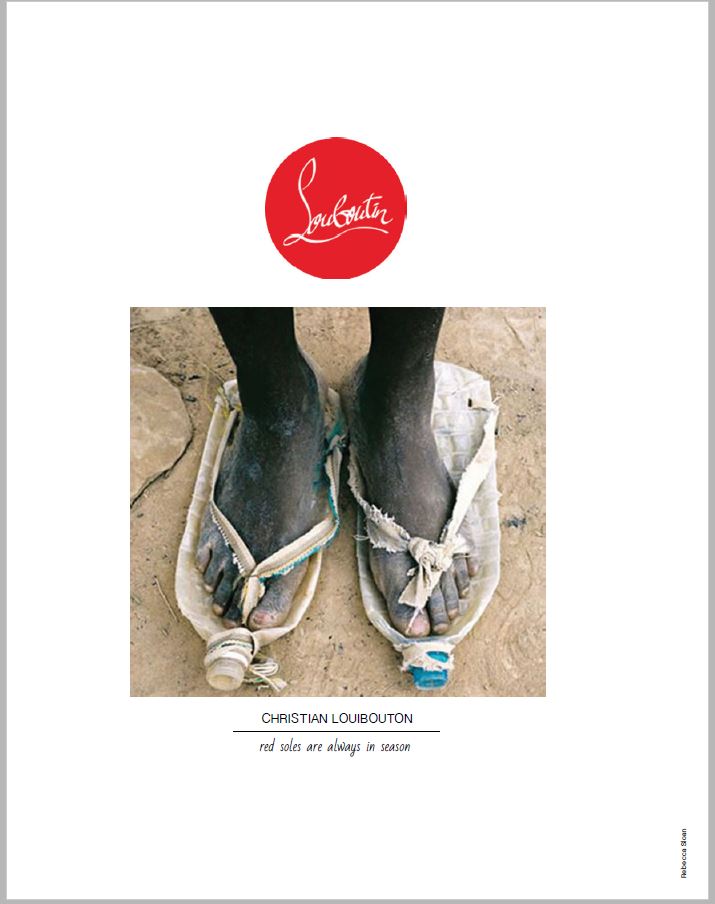
A further way in which Adbusters has been shaped by contemporary sociohistorical contexts can be seen in the use of representation in the 'luxury water' double page spread....

Writing a solid paragraph (PEA)


Eight minutes! Point, evidence, analysis/argument! Make sure you publish this post because these are getting marked!

Go your own way


Use the below textual analysis toolkit to create an analytical 'fact file' of this double page spread. One example for each heading. And be as specific as possible. 

  • Codes and conventions – changes over time? 
  • Layout and design
  • Composition - positioning of masthead/headlines, cover lines, images, columns 
  • Font size, type, colour 
  • Images/photographs - shot type, angle, focus
  • Mise-en-scene – colour, lighting, location, costume/dress, hair/make-up 
  • Graphics, logos 
  • Language – headline, sub-headings, captions – mode of address
  • Copy 
  • Anchorage of images and text
  • Elements of narrative
  • Proairetic, hermenutic, symbolic codes
  • Diametric oppositions 


Tuesday 25 February 2020

'HUGE Summer Primark Haul' - an analysis of a conventional vlog post

Does Zoella offer her audiences a friendly and welcoming mode of address to relate to, or instead does she construct a fetishistic celebration of consumerism? Or perhaps she does both?


  • Low production values and a clear lack of script. Constructs a compelling and relatable persona for the audience. Zoella is a 'real person', with faults.
  • MES: high key unnatural lighting, low production values
  • Constant reference to the brand Primark, a budget clothing superstore, indicating a predominantly working class target audience. Yet does explicate on what Primark actually is or means, inferring a British working class target audience.
  • Accent - well spoken, maybe forced? Bubbly, colloquial, personable.
  • Use of informal language such as the word 'bloody' indicates a relaxed and informal persona
  • Costume is everyday and approachable, comfortable. Low cut top, yet absolutely no sexualisation: atypical representation of women!
  • Makeup is clearly visible yet not particularly over the top: 'going out' as opposed to 'high fashion'
  • Sugg's sits and talks directly to the camera with very little movement. Video structure is straightforward and repetitive
  • Video resembles a long and unscripted advertisement. A cultivation of materialistic and capitalistic ideologies
  • Commodity fetishism - the obsessional quality of a consumer product, for example the swoosh of the Nike logo or the emojis an Apple phone offers it's users over a Samsung handset. Interestingly here it is the low prices and packaging which are being fetishised!
  • Low production values - self shot, camera placed on tripod. Camera frequently goes out of focus. Conventional for a YouTube vlogger, and allows Zoella to appear relatable
  • Consistent use of close ups symbolises the audiences proximity to Zoella. Audience are situated and positioned as a young, working class woman
  • Mise en scene of setting creates homely atmosphere. Clean, bright, with tasteful plants. Again, increases her relatability with target audience
  • "It's just started raining. What is this?" Casual and relateable lexis. Zoella lacks professionalism. Add an element of authenticity

Monday 24 February 2020

A semiotic anlysis of the Louboutins/runway double page spread in Adbusters


  • A confrontational and potentially racist mode of address??? A shocking and controversial set of ideologies. 
  • Binary opposition is constructed between a well known high end fashion designer and the clearly home-made shoes worn by the model. Constructs an ideological perspective that the fashion industry is exclusive, and indeed harmful; to people in developing countries. 
  • Binary opposition between a fashion runway and the refugees struggling to push beyond a fence. Again, constructs an ideological perspective of struggle, poverty and exploitation
  • Postcolonial perspectives: a gutteral mode of address, testing the audience, and suggesting that they are also part of the problem 
  • Extremely low production values on 'red soles' image, like an old cameras phone. Symbolic code of poverty, conflict and a terrible life
  • Expectation of audience knowledge. Adbusters expects audience to be familiar with high end fashion brand, indicating a potentially middle class audience. Are the audience themselves the problem? Does this magazine hate me?
  • High angle, birds eye view shot 'looking down' on the model is symbolic that we, as consumers of the shoes are having an impact on those in a developing country, and are indeed 'looking down' on those less fortunate than us
  • Hermeneutic code of dirty feet presents a question to the audience: "why are these feet so dirty? What life do they lead? How disgusting!" 
  • Breaking of hegemonic norms and values. Bottles are clearly not shoes. They are not fashionable.
  • Intertextual reference to charity adverts such as the water aid advert, a criticism of Louboutins marketing strategy, selling a deliberately trashy aesthetic to extremely rich people
  • Runway page: a binary opposition between harsh, high contrast black and white and rich, colour creates the symbolic connotation of a desirable lifestyle vs a hateful and horrible existence
  • Accuses target audience of being guilty of force people in to poverty. Criticises the capitalist ideology that in order for one person to be rich, another must be poor and exploited. Additionally, even high end brands are often constructed in 'third world' and developing countries for much much less than in would cost otherwise. Countries such as Bangladesh and Indonesia have drastically lower wages to pay, and many fewer laws protecting workers
  • Extremely sparse layout, with very little copy. Forces the audience to construct their own meaning. Complete lack of anchorage. A funny joke??? A highly inappropriate joke??? With no anchorage, the audience are left to make up their own mind.
  • A double page spread
  • A stereotypical representation of an African individual. No apparent gender. Utilises the codes and conventions of a charity advert. Complete lack of anchorage. 
  • Slogan draws attention to the brand identity of Loubitin shoes. Red soles ere refer to bleeding feet, and to global inequality. 
  • Bottles function as a symbolic code for water, drawing to attention a stereotypical lack of water in Africa. 
  • Possible reference to sweatshops?
  • Oppositional reading: [possibly racist and stereotypical?]
  • Draws attention towards accepted truths 
  • Assumption that the readers of adbusters are middle class and comfortably wealthy
  • Preferred reading of guilt
  • MES of bared wire and black and white creates a sense of poverty and conflict

But what can we do? The double page spread presents a stark and terrible world ripped apart by capitalism and inequality. By participating in a capitalistic society, we are complicit and guilty of exploitation. But the spread doesn't offer any alternative! Is this simply hateful for the sake of it?


Bonus - Checking out the Christian Louboutin website I was struck by the edgy, counter cultural ideological perspective constructed by their promotional images. This mid-shot low angle shot of a cheerfully mismatched, scruffy and perhaps even non-hegemonically attractive model (sorry mate) is further anchored throughout the setting and the model's performance, sitting on a tram line. Can you buy looking scruffy and edgy and maybe even looking homeless? Louboutin certainly seem to think so, and you'll pay the best part of £700 for the shoes alone here. 

So what's the message? You will be forgiven for suggesting 'Louboutins are for everyone'. But really? Is that the case? Could a genuinely poverty stricken person buy these shoes? Does £650 really say "yep, come on, these are for everyone?" Surely the ideological perspective of inclusiveness creates a counterpoint with the actual price of the shoes? If Louboutin really wanted to say "we're for everyone", then they'd probably include a budget range. But if they took that stance, they would be backpedalling on their extremely exclusive unique selling point!

High end fashion often presents subversive, trashy and countercultural ideologies that are completely at odds with the extremely high price of the product bveing advertised Advertising sells a lifestyle, and Liuboutin conversely sells a trashy and poverty striken lifestyle to a wealthy target audience. 


Friday 7 February 2020

Assassin's Creed III Liberation - research and audience tasks

1 - Assassin's Creed III Liberation: fact file or poster
2 - Fandom: research and explore a range of examples pertaining to fandom of the Assassin's Creed franchise. You may include merchandise, fan sites, fan fiction, fan videos and fan games
3 - Explore the critical and Fan reviews of ACIIIL. What controversial aspects does this game raise?
4 - Explore the PEGI website. What is it? How does it work? Is it effective?
5 - Theory fact files/posters... make something nice for the walls!

Thursday 6 February 2020

Key assessment six/second year mock exam feedback

Feedback legend


i - You need to use more media language...


ii - You've got to include more application of knowledge and understanding to demonstrate your higher level thinking. This could include presenting a stronger argument, but mainly you need to know the case studies like the back of your hand!


iii - Theory! You should include more! This is big! Really big!


iv - Big concepts and big arguments. Patriarchal hegemony, postcolonial representations and Marxist deconstructions. This is the kind of higher level concepts you should focus on


v - Tone. You use colloquialisms or write in a chatty way. Try to adopt a more formal tone


General feedback


  • Shot types!Camera angles! Mise-en-scene! Setting! Lexis! Modes of address! Costume! Etc! Media language always has been and always will be the bread and butter of media studies, and some students really do need to go back to basics. Forgetting to include Clay Shirky's end of audience theory is pretty understandable, as is misspelling 'Pantene'. However, one thing you really shouldn't be forgetting is media language. A whole bunch of you need to make this your top priority!
  • Try to avoid referring to 'you' or 'they' , as in 'you can see', or 'they have made it like...' etc. Almost refer to the specific group in question, most likely the producer or the (target) audience.
  • Consider how to apply theory. Don't just dump it in, for example 'this is shown through the Madonna/whore complex'. Instead, why not try 'Freud's notion of the Madonna/whore complex allows us to fully understand Anita's status in the Hawkins's household. For example...'


1 - 15 marks


  • Many students utilised Van-Zooen's feminist theory here, in particular the male gaze, but more needed to discuss how it positioned the female heterosexual target audience in such a way as to conform to patriarchal hegemonic standards of female attractiveness.
  • A good comparison here is the Tide advert. But it needed to be utilised as a counterpoint to the advert you were asked to study. In some cases it seemed like you were writing about Tide and not Pantene!


2- 2 marks


  • To get both marks, you needed something along the lines of 'digital convergence is the coming together of previously separate media industries thanks to digital technology"


3 - 12 marks


  • LNWH mainly targets a niche/specialised audience, so in order to get higher marks, you really needed to refer to a radio show with a mass audience appeal.


4 - 15 marks


  • Rather too many responses simply discussed the use of representation in Humans. Yet the question asks explicitly for how representations position audiences. For example, audiences may be positioned in an uncomfortable position with the stereotypical, sexualised representation of women in the brothel scene, or may be positioned in a relatable position by the middle-class mode of address and mise-en-scene of the breakfast scene.


5 - 30 marks


  • If a theory is explicitly named, you must evaluate its usefulness. This was not happening in every response, with several answers simply listing preferred/negotiated and oppositional responses...

Tuesday 4 February 2020

Exploring the audience appeal of Magic Radio

One question we bought up quite early on in the radio unit was 'why does radio still exist'? It's a fair enough question. Through processes of digital convergence, radio has been thoroughly outclassed by digital downloads, streaming sites such as Spotify, and of course the ease of music piracy. Yet radio still lives on, often raking in huge and devoted audience. This nice long article in The Guardian explores the continuing audience appeal of radio through the case study of Magic, a radio station playing golden oldies to a primary middle aged target audience. It goes in to lots of juicy detail about scheduling, targeting, and even audience negotiation. In short, it's an excellent case study to use in your exam. So get stuck in!