Showing posts with label Magazines. Show all posts

Tuesday, 17 January 2023

Woman magazine: initial response and analysing the front cover

 For this session, you will be getting to grips with Woman Magazine, a UK women's lifestyle magazine published weekly for the best part of a century now. The edition we are exploring is from August 1964. Even just reading these basic facts will probably allow you to guess the main argument we'll be making in lessons:

The representation of women has changed significantly in the almost 60 years since this edition was published

Task one - familiarise yourself with the magazine

You can find the pages of Woman we have to study by clicking here. 

Look through it. You don't need to read every word. Briefly answer the following questions in your notes, using SPECIFIC EXAMPLES TO BACK THEM UP. Yes, I know that Woman magazine is targeting women. But how do you know? And what demographic of women?

  • Who is the VERY SPECIFIC target audience for this magazine? How do you know?
  • What stereotypical representations can you find?
  • Who is not represented or is underrepresented in this magazine?
  • What genre is this magazine? Is it typical of it's genre?
  • What examples of lexis in this magazine may strike you as interesting, or strange?
  • What message is the producer of this magazine presenting to its audience?
  • Why might a woman in 1964 actually read this magazine?
  • What messages about woman are presented in this magazine?
  • How might a woman react to this magazine in 1964? How might a woman react to this magazine in 2023?
  • How could this magazine be appealing to audiences?
  • What uses and gratifications does it provide to it's audience?

Task two - analysis of the front cover


The front cover is the most important page of a magazine. It sits on a shelf in the newsagent and it screams BUY ME! But it doesn't scream to everyone. For example, Woman magazine is not 'talking' to a male audience. 

This process is called modes of address, because the magazine uses very specific elements of media language to address or talk to its target audience. 

Media language is everything on the toolkit. Shot type, camera angle, colour, mise-en-scene, lexis.... all of this is media language. And it CONSTRUCTS MEANING.


This is the front cover of Woman. Know it well. You WILL be talking about it in the final exam!

How does the front cover of Woman magazine make meaning and address it's audience? Make reference to: 

  • Codes and conventions – changes over time? 
  • Layout and design
  • Composition - positioning of masthead/headlines, cover lines, images, columns 
  • Font size, type, colour 
  • Images/photographs - shot type, angle, focus
  • Mise-en-scene – colour, lighting, location, costume/dress, hair/make-up 
  • Graphics, logos 
  • Language – headline, sub-headings, captions – mode of address
  • Copy 
  • Anchorage of images and text
  • Elements of narrative

Here are a couple of more leading questions if you are feeling uninspired:

What does the purple background symbolise? 

How old is the model? Why is this important?

How can we describe the mise-en-scene of her facial expression?

Why has the producer chosen this particular font for the masthead?

What assumptions does the lexis of the coverlines (coverlines are headlines but on a maazine!!!!) make?


If you do not make notes, this information is lost, forever! Please don't waste your precious time!

Sunday, 10 July 2022

KA4/1st year mock exam 2022: feedback and mark scheme

Please, please, PLEASE read the whole of this post before asking any questions, because I promise 99% of your questions are answered below!

What's this in my email?

If your teacher is Michael, you may have received or will very shortly receive an email with your grade. But it won't look like your grade. It will look like a string of numbers.

Here's an example:


Read from left to right, this translates as:

Q1 mark - Q2 mark - Q3 mark - total mark - fine grade (1 is high, 3 is low) - feedback


Green means you exceeded your target minimum grade. Your target minimum grade is calculated from your GCSE grades. Red means you got less, yellow means you got the same, ie what is expected of you.

You can find out what the feedback means and how well you done in each question by simply checking out this post!

How we give feedback

In A-level media studies, we give feedback in four different ways:

1 - Straightforward feedback

You will get at least one piece of blunt feedback, indicated through a lower case roman numeral (eg i, ii, ii, iv...). This is the one thing (or sometimes two things) you should focus on next time. Frankly, this is the most important bit of all.

2 - A mark

A mark gives you a rough indication of how well you did in a particular question. You'll need to check out the mark scheme below for what your mark means...

Remember, in media, a mark doesn't mean a right answer. So getting 10/15 doesn't mean you got 10 things right and five things wrong! Instead it's more of a value judgement that your teacher or examiner will come to.

3  - A grade

Grades are actually the least important thing here, but they give you an indication of roughly where you are up to. Grades are not important because they are now the same as a final grade. Pedagogical studies basically suggest never giving students grades ever and only giving them suggestions for improvement. So why do we give grades? Because we have to.

4 - Qualitative feedback/indicative content

 This is the stuff that you could and should have talked about. Honestly, you should read this bit very carefully. Back in the bad old days we used to write this stuff on your sheet, but it's a total waste of time, because it takes ages writing the same old thing over and over. If one student writes something really good or misses something out that they shouldn't have, it will be included here! Digital technology rocks!

Questions and mark scheme

You can use this section to work out where your strengths lie!

Media language

1 – Explore how the combination of media language constructs meaning in the music video to Bad Habits by Ed Sheeran [15] [suggested time: at least 30 minutes]

Apply knowledge and understanding of the theoretical framework of media to analyse media products

5 - 13-15 marks

• Excellent, consistent and accurate application of knowledge and understanding of the theoretical framework to analyse the music video

• Analysis of the music video is perceptive, detailed and is likely to be informed by relevant theories

4 - 10-12 marks

• Good, accurate application of knowledge and understanding of the theoretical framework to analyse the music video

• Analysis of the music video is logical and may be informed by relevant theories 

3 - 7-9 marks

• Satisfactory, generally accurate application of knowledge and understanding of the theoretical framework to analyse the music video

• Analysis of the music video is reasonable and straightforward

2 - 4-6 marks

• Basic application of knowledge and understanding of the theoretical framework to analyse the music video, although this is likely to lack clarity, relevance and accuracy 

• Analysis of the music video is undeveloped and there may be a tendency to simply describe features of the music video

1- 1-3 marks

• Minimal, if any, application of knowledge and understanding of the theoretical framework to analyse the music video with significant inaccuracies, irrelevance and a lack of clarity 

• Analysis of the music video is superficial and generalised

0 marks

• Response not attempted or not worthy of credit

Representation 

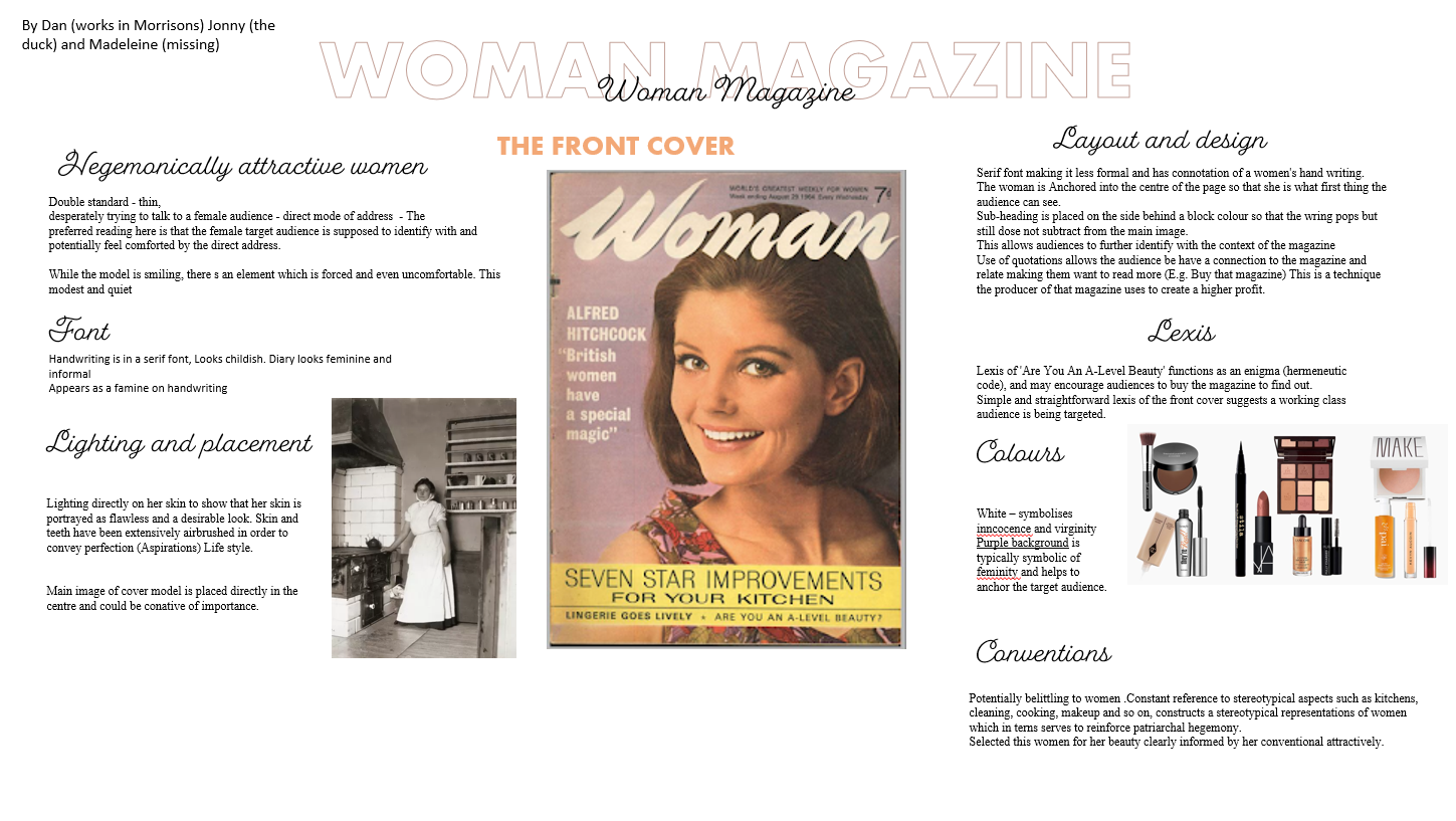
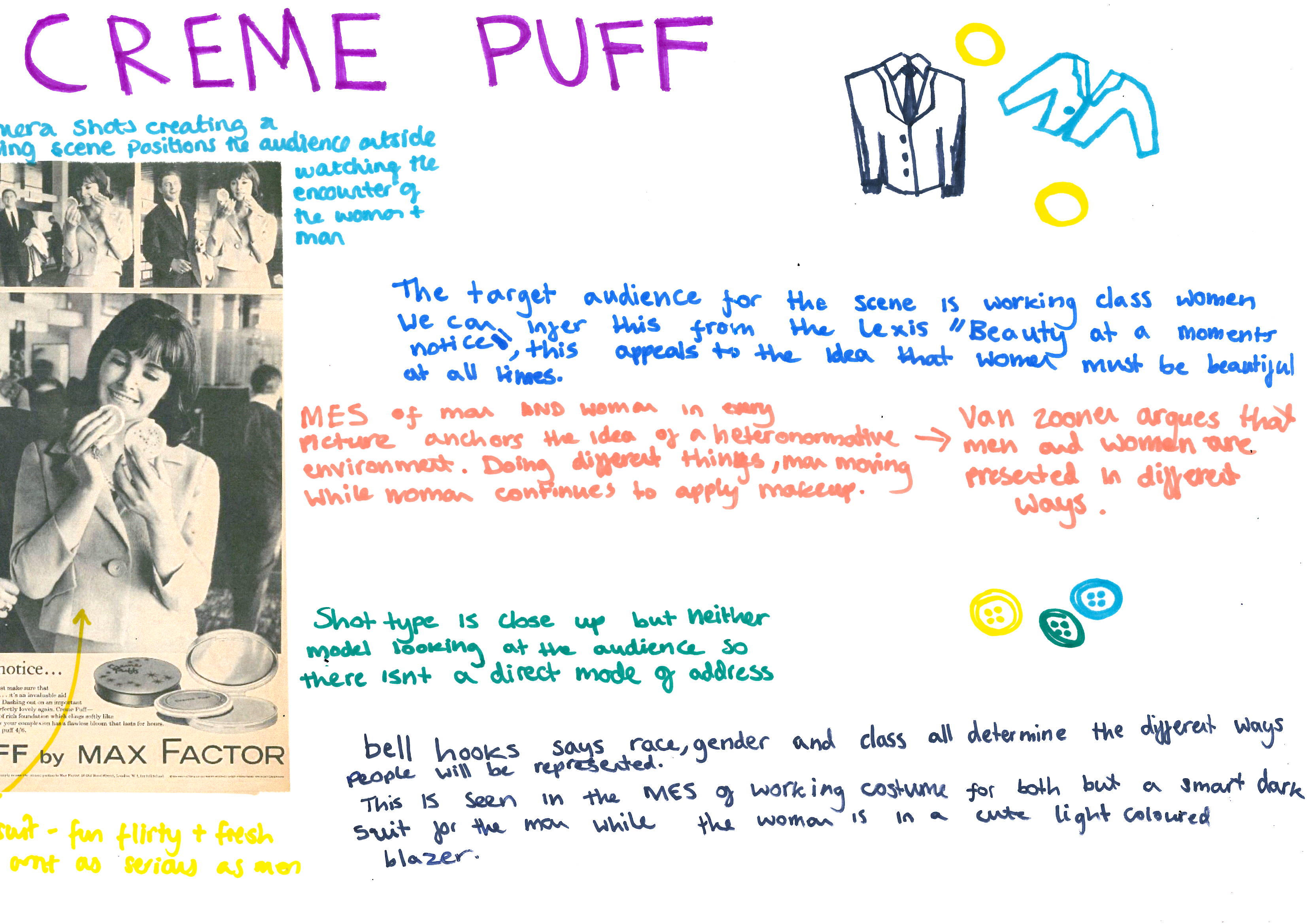
2 – Explore the extent to which historical contexts influence representations in the set edition of Woman magazine [15] [suggested time: at least 30 minutes]

Apply knowledge and understanding of the theoretical framework of media to analyse media products, including through the use of academic theories

5 - 13-15 marks

• Excellent application of knowledge and understanding of the theoretical framework to analyse the set product 

• Analysis of the extent to which representations in the set product are influenced by historical contexts is perceptive, insightful, and informed by a detailed knowledge and understanding of relevant aspects of the theoretical framework 

4 - 10-12 marks

• Good application of knowledge and understanding of the theoretical framework to  analyse the set product 

• Analysis of the extent to which representations in the set product are influenced by historical contexts is logical and  informed by a secure knowledge and understanding of relevant aspects of the  theoretical framework 

3 - 7-9 marks 

• Satisfactory application of knowledge and understanding of the theoretical framework to analyse the set product 

• Analysis of the extent to which representations in the set product are influenced by historical contexts is reasonable and straightforward, demonstrating a generally sound knowledge and understanding of relevant aspects of the theoretical framework 

2  - 4-6 marks 

• Basic application of knowledge and understanding of the theoretical framework to analyse the set product 

• Analysis of the extent to which representations in the set product are influenced by historical contexts is undeveloped, demonstrating a partial knowledge and understanding of relevant aspects of the theoretical framework. There may be a tendency to simply describe features of the set product. 

1  - 1-3 marks 

• Minimal, if any, application of knowledge and understanding of the theoretical framework to analyse the set product 

• Analysis of the extent to which representations in the set product are influenced by historical contexts is superficial and generalised, demonstrating little or no knowledge and understanding of relevant aspects of the theoretical framework 

 0 marks

Response not worthy of credit

Media industries

3 – For 3a to 3e, define the following terms. In each instance, one mark shall be awarded for a correct definition, and a further mark will be awarded for a valid example [suggested time: 10 - 20 minutes]

Marks should be given to any reasonably complete definition, and any reasonably relevant example. Here are a selection of examples which would get both marks. Remember you should spend two minutes on a two mark question, or thereabouts, which is enough time to write two sentences.

a. Vertical integration [2]

Vertical integration refers to when a media conglomerate owns both the method of production and distribution. An excellent example of vertical integration would be Disney, who not only own a range of film studios (for example Pixar), but also the method of distribution these films directly to the audience (for example, through Disney +)

b. Conglomeration [2]

Conglomeration refers to the process of a company acquiring other companies, for the purposes of power and profit. An example of conglomeration would be Disney acquiring Marvel Studios.

c. Digital convergence [2]

Digital convergence refers to the coming together of previously separate industries thanks to digital technologies. An excellent example of digital convergence is Amazon using it's Prime distribution service to digitally distribute videogames in addition to films

d. Regulation [2] 

Regulation refers to the rules and restrictions a media industry must follow. An excellent example of regulation is the British Board Of Film Classification, who regulate the UK film industry, and mandate the inclusion of age certificates on all films released theatrically or on physical media in the country.

e. Tabloid [2]

A tabloid newspaper is a small format newspaper, that typically uses a more informal mode of address and a focus on soft news to target a working class audience. The Daily Mirror is a UK tabloid.

f. Political bias [2]

Political bias refers to the explicit favouring of one political party over another. For example, The UK tabloid The Daily Mirror is clearly biased in favour of both the labour party, as well as the royal family, which can be seen through it's selection of stories

g. Horizontal integration [2] 

Horizontal integration is where an organisation acquires another company in the same sector. An excellent example of this is the UK publisher and distributor Reach PLC, who specialise in producing and distributing newspapers, including Cambridge news and The Daily Mirror

Marks and grade boundaries 

E – 15 – 35%

D – 19 – 43%

C – 23 – 52% 

B – 27 – 61%

A – 31 – 71%

A*- 36 – 81%

Feedback legend

i - This number means you need to include more media language. Shot types, camera angles, serif font, mise en scene... this is how you get marks! If you got this numeral and you including a bunch of media language, you might be confused. "Why did I get this feedback?". Because you need to include more media language! That's it. Even more! This is and always will be the most given bit of feedback, so you're in good company!

Next time, go crazy with media language!

ii - This number means you need to apply your use of media language more effectively and suggest what meanings the media language constructs. For example, "Bad Habits uses low key, artificial lighting throughout the video" is great, but if you added "which creates a dark and oppressively atmosphere, reinforcing the themes of misery, death, and the vampire genre", this would be even better! Again, if you get this number and you feel you were doing this already, you simply need to include more!

Next time, really hammer home the deeper meaning of whatever it is that you are studying!

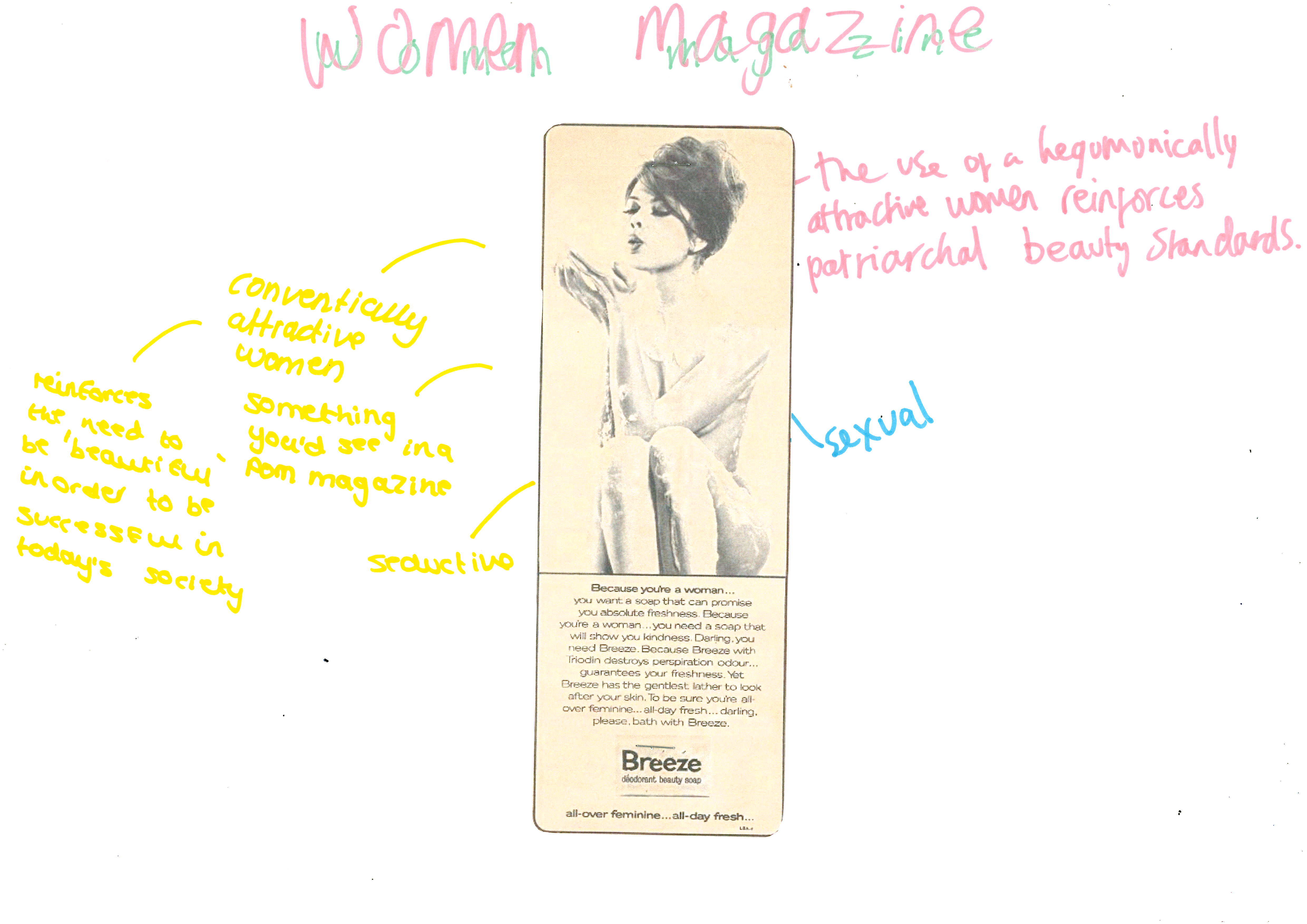
iii - This number means you should include more reference to theory. Theory is technically non-essential, but a well placed theory ALWAYS backs up your point, especially when applied in a sophisticated way. For example, "thorough the anchorage of conventional makeup and the hegemonically attractive model, the producer of Woman magazine reinforces the hegemonic ideological perspective that women's sole function within a media product is to appeal to a perceived heterosexual male audience". What this sentence does is casually make reference to Van Zoonen, without even mentioning her name. Very smooth!

Next time, cram more theory in! 

iv - This number means you should present a clear and opinionated argument, or point of view. If you get this number, it typically means that you have ticked every other box on the list, and now need to push yourself further. Presenting a clear, opinionated point of view, while backing it up with clear and appropriate examples from the text is the 'secret sauce' to getting an 'A' grade in the final exam. It's a tough road ahead, but you can do it!

Next time, be even more opinionated!

Indicative content

Question one (analysis of Ed Sheeran video)

  • It was great seeing students writing plans, using paragraph structure, and clearly having taken this very seriously indeed. By and large, the students who clearly had done more revision got better marks. This should be obvious, and examiners will sniff out hard work from a mile off!
  • There were some extremely strong responses here. If I was being pessimistic, I would point out that it wasn't a real unseen question, and students clearly had a lot of opportunities to      MES. You really don't need to spend an entire page analysing the rose! Much better to discuss the anchorage formed by the combination of lots of different elements of MES! Why not discuss how the symbolic, gothic connotations of the wilting rose form a binary opposition to the grimy, inner-city setting, which is further reinforced through the MES of bleak, low key artificial lighting? 

Question two

  • I could have called this advance. Several students wrote excellent responses... and lost marks due to not making reference, or enough reference to the historical context surrounding the time in which the magazine was made!
  • More successful students made explicit reference to a range of examples. Less successful students tended not to.
  • Students tended to be very strong on referencing things like patriarchal hegemony and how the magazine manipulates the ideology of the audience. However, students were less strong at actually using media language to back these points up! You MUST back everything up with media language!

Question three - short answer questions

  • After marking the first two questions, which students tended to do very well in, I was surprised by the many weak responses to this section. There is a big part of the A-level media studies course that frankly involves memorisation, and if you do not know the specific difference between vertical and horizontal integration, for example, you will find yourself in trouble
  • Therefore, a lot of you need to get busy with flash cards!
  • However, students who did well on this section tended to do really well. Basically this question threw the entire exam

Exam tips

Invigilating an exam, watching students write and having time to stare in to space, I came up with the following straightforward, no-nonsense exam tips to hopefully help you on your way...

1 - Work out exactly how long you should spend on each question before you get in to the exam, and then stick to that timing, no matter what!

2 - Keep things nice and structured by using DAC and PEA to structure your paragraphs

3 - Don't go back and check your answers: use the precious time you have to keep on writing!

If you finish early, you should keep writing. Pick another point, and keep writing. You can use an asterisk to tell the examiner where the paragraph should have gone

5 - It's not 'waffle' if you make reference to media language. So you can rant on about whatever you like as long as you make reference to subject specific terminology!

Friday, 24 June 2022

Essay structure practice: Woman magazine

This is not 'your' copy of Woman magazine, but I was getting a bit bored of the set copy. Anyway, this one is really, really similar. Which just goes to underlie exactly how straightforward, stereotypical and sexist this publication is!


Underline key terms - underline as few terms as possible. You'll be using these terms a lot in your answer!

How does the producer of Woman magazine use ideology to represent women

Knee jerk reaction - don't think: this is your completely honest, first reaction to the question!

The producer of woman magazine uses sexist ideologies to portray women

Plan - keep it simple, and whatever you do, make sure that your plan goes on the question paper, where the examiner can see it!

Audience positioning
Heteronormativity
Patriarchal hegemony 
Binary Oppositions 
Hegemonic norms
Stereotypical 
Housewife
Sans serif
Serif
Anchorage
Shot types
Modes of address
Colours
MES
Demographic 
Lexis
Narrative

Introduction - use DAC for introductions. You can skip the introduction for shorter questions!

DAC, definition, argument, context 

Definition - Representation refers to the way in which something is re-presented by the producer to maximise profit and to demonstrate their ideology. Ideology refers to the views and beliefs of the producer and society at large.

Argument  - In this essay, I shall argue that the producer of Woman magazine uses sexist ideology to keep women in the hegemonic norms of the time

Context  - The set edition of Woman magazine, a women's lifestyle magazine, published in 1964, and life for women was dictated by patriarchal standards. In this post-war Britain, however, second wave feminism saw the rights of women changing rapidly , though this is not acknowledged by Woman magazine, a magazine which sold in excess of three million copies a week.

Paragraphs - use PEE for paragraphs. The (p)oint relates to the question, the (e)xample comes from the media product, and the (e)xplanation usually rolls in to the (e)xample...

Point - One way Woman magazine portrays women in a sexist and straightforward way is through it's striking and straightforward front cover

Evidence - For example, the masthead on the front cover of the magazine is presented in a serif font which resembles feminine handwriting. This is further anchored through the lilac background of the front cover which functions as a symbolic code, suggesting femininity, softness and other stereotypical perspectives about women. Finally, the cover model is constructed through the MES of her hair and makeup, which are both very conservative and straightforward.

Explanation - These elements all combine to construct a stereotypical ideology of the producer related women. The assumption that women should be feminine is an example of a patriarchal hegemonic norms, and the producer is clearly using this ideological perspective to manipulate and to keep women in their place. Additionally, through constructing a stereotypical and straightforward audience, the producer ensures that this audience comes back week after week after week. 

U2 block Woman magazine revision posters


Wednesday, 8 June 2022

Possible arguments for each industry

Humans and audience - Humans primarily targets a niche audience of pre-existing science fiction fans, but it also targets a range of secondary audiences of more general demographics 

  • Excellent example: opening shot of ECU of eye is an intertextual reference to Blade Runner, and will appeal to hardcore sci-fi fans
  • Another example: the confusing advertising campaign blended fact and fiction, which will appeal to hardcore fans of science fiction

Les Revenants and representation - Les Revenants uses highly atypical representations to confuse and challenge the target audience

  • "representation is a reconstruction of reality made by the producer to convey their ideology'
  • Possible representations: historical context, gender, location, stereotypes, men, women, children

Magazines, media language - "Woman magazine uses media language in a simple, straightforward sexist way to appeal to a huge target audience, while Adbusters uses media language in an anti-capitalist, atypical and confusing way to manipulate the political ideology of it's niche target audience

  • Woman: straightforward and very sexist to reinforce dominant hegemonic patriarchal ideologies
  • Adbusters: ant capitalism, radical, criticises commodity fetishism, anti advert, lacks anchorage, polysemy, not for profit

Online media, media industry - Zoella and Attitude are both simple and straightforward products that use every opportunity to minimise risk and maximise profit

  • Regulation
  • Digital technologies
  • Hypermodality

Monday, 23 May 2022

Revision: Comparing Woman and Adbusters 2

How does media language reinforce and cultivate dominant ideological perspectives? Make reference to the set editions of Woman and Adbusters

Dominant ideology refers to the generally accepted norms and ideas in our society. An ideology is a belief held by the producer. Media products typically encode ideologies through media language. In this essay I shall argue that woman magazine presents a sexist, stereotypical and straightforward ideology to it's target audience, while Adbusters uses media language to attempt to incite revolution.

Woman presents a manipulative mode of address to reinforce it's dominant ideology. One excellent example of this is the Are You An A-level Beauty makeup tutorial. The lexis used throughout the article is both forced and domineering, for example "brightens a dull complexation", which infers that the target audience are both dull and unattractive and must follow a tutorial to be hegemonically attractive. The repetition of the lexis 'A-level ' conveys and reinforces an ideology that the target audience are less educated, and will benefit from Woman magazine's education. This is anchored through the layout, which is simple, straightforward, but also packed with detailed information. This busy and full on mode of address makes a clear assumption that women require step by step guidance on how to look hegemonically attractive. 

  • Condescending mode of address constructed through the lexis of 'A-level'
  • Uses the term 'girls' to refer towards a middle aged audience
  • Direct address of MES of eyes staring at the target audience: intimidating and manipulative

However, Adbusters presents a complex set of ideologies, which present a confusing and offensive mode of address. The Louboutin double page spread presents a highly polysemic mode of address that is simultaneously offensive and challenging. A clear binary opposition is constructed between high end fashion and absolute poverty. A black and white mid shot of screaming refugees behind the grim MES of barbed wire is set against a conventionally attractive set of catwalk model's legs. This is further reinforced through the rich, royal pink of the garment in opposition to the bleak black and white of the refugee camp. This binary opposition constructs a complex set of ideologies. The target audience are addressed as the greedy, selfish problem that is completely ripping apart our society. This aggressive and offensive mode of address constructs a highly anticapitalist and revolutionary ideology. Adbusters expects it's target audience to violently challenge the capitalist system in which we live in. In a recent tweet, the producers argue the audience should go out and deflate tyres as well as other forms of vandalism. 

The end.

Friday, 20 May 2022

Revision: comparing Woman and Adbusters 1

 To what extent does cultural context influence how magazines create meaning? Make reference to the set editions of Woman and Adbusters


This bathtub is over £5000 at retail. Adbusters present an anticapitalist ideology that challenges such excessive consumerism. But they do so in a deliberately confusing, atypical manner, that lacks any form of anchorage or even context. This makes Adbusters a highly subversive and challenging magazine!

Cultural context refers to the context that exists at the time a media product is made. In this essay, I shall argue that both magazines I have studied completely reflect the cultural context of the time in which they were made, through their own specific uses of media language. In order to argue this, I shall be comparing Woman, a woman's lifestyle magazine first published in the 1930's that was selling millions of copies in the 1960's, and is wholly sexist, stereotypical and straightforward, and Adbusters , an unconventional magazine that addresses niche political issues and completely lacks any form of anchorage or any paid for advertising.

One excellent and striking way that Woman magazine reflects the social and cultural context of 1964 is through it's paid for advertising. Roughly 1/3 of a magazine's revenue comes form advertising, and since woman magazine reaches such a vast audience, advertisers will pay a premium. The Breeze soap advert presents a heavily sexualised representation of a young, hegemonically attractive woman. This is reinforced through the MES of the model's slim figure and her lack of clothing. Her nudity is emphasised through her performance, with her legs playfully propped up, and her breasts partially covered by her arms. The suggestive placement of the MES of soap constructs a highly sexualised symbolic code, constructing an ideology that be be feminine, one must be clean and also hegemonically sexually attractive. This further anchored through the use of lexis "because you are a woman", which further enhances the ideological perspective that not only are the target audience clearly women, but they must listen to and accept a particularly demanding mode of address. The advert takes an explicit and sexualised mode of address in order to manipulate its easily influenced and less educated target audience. This ideological representation is clearly present to uphold patriarchal hegemony, and therefore can be seen as both highly damaging and sexist. This reinforces the attitudes towards women during the 1960s. 

However, Adbusters takes a completely different approach to the representation of women. In the Zucchetti double page spread, a striking similar image of a nude woman in the bath is used. However, remarkably, the nude woman in Adbusters is not even slightly sexualised. This is a surprisingly atypical representation of a woman.

  • MES of bland, dull, desaturated colours
  • MES of wrinkly hands suggests abundance of water
  • MES of tattoos may have associations with poverty and a criminal lifestyle 
  • A highly polysemic representation of women, which can be interpreted in many different ways
  • bell hooks - feminism is for everyone: a challenging representation of a non sexualised woman
  • A deliberate statemen and an attempt to challenge the sexualised representation of women 

Another way in which the cultural context influences meaning in adbusters is through it's complete lack of anchorage...

These elements of media language combine to construct a complex set of ideologies. This is important, as Adbusters reflects the cultural and social issues that are important in modern society. 

Wednesday, 18 May 2022

Revision: Binary oppositions and Adbusters


Claude Levi-Strauss argues that our comprehension of the world is entirely contingent of a range of diametrically opposed concepts. Evaluate this structuralist theory. Make reference to the set editions of Woman and Adbusters

Knee jerk reaction: we make sense of the world through binary oppositions

DAC introduction

Binary oppositions are where two concepts or ideologies are presented against each other, as opposites. In this essay, I shall argue binary oppositions are an essential part of how we and how audiences make sense of the world. In order to explore this idea, I shall be looking Woman magazine, a 1964 women's lifestyle magazine which extensively uses stereotypical representations, and is typical of it's genre, and Adbusters, a progressive and confrontational magazine that combines a range of atypical genres including political ,anti capitalist and art and design.

Women magazine presents a series of highly stereotypical and straightforward ideologies to it's target audience, for the purpose of maintaining patriarchal hegemony. The front cover contains many examples of this...

Adbusters presents a confusing mode of address to it's target audiences, as it lacks any form of anchorage. An excellent example of it's atypical approach can be found on the 'homeless woman' double page spread

  • Layout of magazine positions the homeless woman in the front and centre of the right hand page, She is constructed through a mid shot, which reinforces and cultivates the ideology that the homeless woman is small and vulnerable. 
  • Additionally, the audience are positioned in in a direct mode of address, and additionally a relatable and uncomfortable mode of address. By being positioned as passer by, the audience are forced to make a choice; to either help the woman or not to help. However, since we are distanced from her through a lack of anchorage, which positions the audience is a simultaneously guilty and privileged mode of address. This deep and symbolic binary opposition constructs a highly confusing mode of address for the target audience. 
  • However, on the other side of the double page page spread is a binary opposition of the homeless woman. A close up shot of a hegemonically attractive model. The model is addressing the audience directly, with a facial expression that connotes sophistication and drama. The model lacks stereotypical codes of either male or female identity, that makes them highly androgynous. It is not immediately clear what this model symbolises, or their relation to wither the homeless woman, the written extract, or even the lexis of '350 PPM. This constructs a highly confusing and atypical mode of address for the target audience. 
  • However, a highly polysemic set of meanings are constructed. Some audiences may conclude that the model and the homeless woman construct a deep and symbolic binary opposition between absolute luxury and absolute poverty. The lexis 350ppm is related to pollution and climate change. However, a huge assumption is being made of the audience that they are engaged in political and environmental issues, and that they will implicitly understand what is being bought up here. 
  • The Adbusters Media Foundation are therefore making a huge assumption of their target audience: that they are highly educated and will understand the issues being presented here. However, even less educated audience members will certainly understand the binary opposition between rich and power, and between wealth and inequality. This potentially allows adbusters to target a larger and more diverse audience. 

Tuesday, 17 May 2022

Revision: Adbusters Cover analysis


  • Adbusters presents a deliberately confrontational mode of address, which is emphasised through it's total lack of anchorage 
  • MES of the costume of the cover model has militaristic connotations, due to the camouflage colours and the utility pockets. This has significant connotations of war, death and threat, which are potentially highly alarming to the target audience. 
  • Unconventional positioning of the masthead creates a confusing and atypical layout for the target audience. By changing the masthead every time, Adbusters not only lacks consistency, it also lacks brand identity. Adbusters brand identity is trashy, confusing, and contradictory. By changing the masthead every issue, the magazine is committing a significant financial risk. Adbusters presents an anticapitalistic, anti profit ideology that goes against hegemonic capitalist ideas in our society.
  • Not for profit, makes enough money to keep making the magazine
  • Adbusters presents a progressive range of ideologies and a desire to change society. This is symbolically encoded through the constantly changing house style of the magazine. Adbusters asks the audience to reject capitalism and brands, and other hegemonic conventions. 

Adbusters is
Complicated
Challenging
Atypical
Deliberately confrontational
Polysemic

  • The MES of the brown 'dirt' covering the model and the masthead has many polysemic interpretations. Some audiences will decode that this is mud, and this will reinforce connotations of war, death and barbarity. Other audiences may see it as film grain, which has connotations of damage and age and general degradation. However, the dirt effect is actually an attempt to make the front cover look badly and cheaply printed, which obscures several key elements. This may simply be to capture the audience's attention and provide a unique selling point. However, this cheap looking printing also constructs a deliberately trashy punk ideology, that challenges the viewers expectations of what a magazine should look like. Additionally, it reminds the target audience that we live in a dangerous, complicated and dirty world filled with danger. 
  • The cover model is screaming towards the audience in an angry and direct mode of address. This further anchors the magazines confrontational status. Additionally, the combination of the model's middle eastern ethnicity, combined with the lack of anchorage constructs him as a stereotypical terrorist. By forcing the audience through the lack of anchorage to come to a stereotyped and even racist conclusion, the magazine is positioning the audience in a deeply confrontational and unpleasant mode of address.
  • The main and only cover line uses the lexis post west, which presents many polysemic meanings for the target audience. One interpretation is that it refers to the destruction of the Western world, and the state of the world that we know will soon end. This is clearly highly confrontational, and extremely unpleasant for the target audience.
  • We live in a confusing and difficult to understand world
  • By using the term west, the magazine is using deliberately confrontational and othering language language, that forces the audience to confront their prejudices
  • Adbusters presents a nihilistic ideology to it's target audience that suggests that nothing matters, and there is nothing that we can do to change anything While this may in fact be true, it limits the usefulness of the magazine, and arguably positions the audience as the problem. this condescending mode of address arguably desensitises the audience to real problems

Friday, 13 May 2022

Revision: Analysing the front cover to the set edition of Woman magazine


R block 

How have the conventions of the genres of the magazines you have studied changed over time? (sorry this question is a bit wonky but you get where I'm coming from...)


Genre refers to a type of media product. Genre is important as it allows the producer to use conventions to target a specific audience. I shall argue that both the genres of both the magazines I have studied have changed wildly over time. In order to make this argument, I shall be looking at the 1964 edition of Woman, a highly conventional women's lifestyle magazine targeting a very straightforward audience, and Adbusters, a highly atypical magazine that broadly targets an activist and countercultural audience. 

  • One way in which Woman conforms to the genre conventions of the woman's lifestyle magazine is through it's highly typical for the time sexist representations of women. 
  • MES of the light purple background has symbolic connotations of femininity, and reinforces stereotypical expectations of the female target audience
  • Lexis of the word kitchen makes a strong assumption that 'all women' are interested in cooking, and reinforces stereotypes
  • Lexis of the term 'lingerie' as opposed to a more neutral term like 'underwear' implies that the middle aged female target audience should be living up to expectations of sexual attractiveness. This reinforces hegemonic norms and objectifies the target audience
  • Lexis of 'A-level beauty' helps to construct standards of hegemonic beauty norms. Conventional of the woman's lifestyle magazine, as it is a standard feature
  • Lexis of the term 'A-level' suggests a level of expertise obtainable by older teenagers. By using this term, the producer is insinuating the target audience is naïve and must 'revise' their knowledge of beauty. Highly patronising mode of address
  • Lexis of 'British women' suggests that British women are more significant and more capable than other women, which reinforces nationalistic ideologies
  • Font of masthead is serif, which has connotations of informality through resembling handwriting. This presents an informal, even childish mode of address. This infers a less educated, working class audience. This reflects the realities of being a woman in the 1960s, where typically women would have less of a standard of education
  • MES of floral dress reinforces sociohistorical expectations that women should appear beautiful for the gratification of the patriarchy. By conforming to the genre conventions for the women's lifestyle magazine, the producer of Woman is constructing a straightforward identity for the target audience to identify with. 
  • Performance of the warm and friendly, yet simultaneously uncomfortable smile of the front cover model is highly conventional of the genre. The excessive, over the top nature of her smile is typical of the expectations that women face in society. The excessively smiling woman therefore reinforces patriarchal hegemonic values of the producer, and helps the magazine to target a basic and straightforward female target audience. 
  • Direct mode of address constructed through 'for your kitchen' suggests a straightforward and easily influenced target audience. 
  • Minimal use of makeup on model, which reinforces ideologies of 'natural beauty', and an expectation that women should be beautiful if they are to have any societal value 
  • Lexis of Alfred Hitchcock suggests a patriarchal hierarchy. Despite the mag being called Woman, the name of a man is given top billing...


T block


To what extent are the magazines you have studied typical of their genre?


Genre is a way of categorising media products. Genre is important for audiences as it allows them to identify different products. In this essay I shall argue that one of the magazines I have studied is typical of it's genre, yet the other is completely atypical. In order to explore this, I shall compare the 1964 edition of Woman magazine, a woman's lifestyle magazine which appeals to a highly stereotypical audience, and Adbusters, a highly subversive magazine which appeals to extremely niche audiences.

  • Lexis of Seven Star Improvements For Your kitchen anchors the audience to the opinion that this magazine is luxurious and glamourous. However, this mode of address reinforces a sexist hegemonic norm. 
  • MES of calligraphy/handwritten typeface of the Masthead 'Woman' emphasises the stereotypically feminine feel to the composition of the front cover. It also has connotations of luxury, and a classic, old fashioned feel even in 1964. An established brand. 
  • Masthead font is in serif, which has connotations of femininity and an informal mode of address
  • MES of the gold highlights to the featured cover lines is symbolic of love, luxury and femininity
  • Lexis of "lingerie" has connotations of luxury, but also of sexualisation. This reinforces a then popularly held hegemonic norm that in order to be successful, women must be hegemonically beautiful. This in turn reinforces patriarchal hegemonic beauty standard of women. 
  • MES of the makeup of the cover model constructs an ideology and hegemonic norms that women should look flawless. This is a classic example of the male gaze, and reinforces sexist stereotypes
  • Cultivates hegemonic patriarchal norms through repeating ideological perspectives
  • Lexis of the cover line 'A-level beauty' reinforces the ideology that in order to be successful, women must conform to beauty standards, eg makeup
  • A-level is an 'advanced' level exam, and explicitly ranking women is an example of dehumanisation, and considers only 'advanced' level 'beauties' as being important
  • Lexis of 'A-level beauty' example of infantilization, and compares the adult target audience to a much younger teenager. Additionally, this reinforces the ideological perspective that in order to be attractive, a woman must look significantly younger
  • Direct mode of address made by the model staring directly in to the camera. The preferred reading of this gesture is to cultivate a friendly mode of address, which is further anchored through the personal feel of the handwritten masthead
  • The combination of stereotypically feminine elements cultivates and constructs a target audience which is highly stereotypical, and will agree with the ideology of the producer
  • But why is Woman magazine so sexist and straightforward? Partly because of the time in which it was made, but there were many societal changes happening in the 1960's, including access to contraception and the struggle of the women's liberation movement. 
  • By presenting a simple, straightforward and easy to understand ideology, Woman magazine is able to appeal to the largest audience possible, and therefore make the most money. Therefore it's sexist ideologies are purely motivated by power and profit. And, by reinforcing patriarchal hegemonic values, Woman magazine helps to construct a simple and basic world where men are in charge, and women are subordinate. 


P block


How do the magazines you have studied use media language to convey their genre?

  • Cover model is stereotypically hegemonically attractive, and will function as an aspirational role model for the target middle aged audience. The model selected is in her late 20's to early 30's, which is younger than the target audience, and constructs the hegemonic value that in order to be beautiful, the audience must look as young as possible. 
  • The MES of the purple backdrop is a highly stereotypical 'feminine' colour, lilac, the colour of flowers and this reinforces the ideology in order to be stereotypically feminine, a woman should be associated with certain colours. Additionally, purple has connotations of luxury. which is further anchored through the selection of gold for the boxout/highlighted cover lines at the bottom. To the working class audience, this constructs an aspirational mode of address. 
  • The lexis in the headline associated with the famous film director Alfred Hitchcock directly addresses the target audience. The selection of language "British women have a special magic" functions as a symbolic code, and suggests underlining sexual connotations. Once more, for the target working class audience, to be sexualised by Alfred Hitchcock is an aspirational goal. Furthermore, the lexis "British" is clearly an address to the nationalistic British audience. 
  • The makeup of the model is bold and heavy around the eye, which anchors the lexis 'special magic'. The makeup functions as a proairetic code, and suggests a future romantic engagement. This is an excellent example of Van Zoonen's notion of the male gaze, and situates the model as an object of male desire. 
  • The MES of the model's piercing eyes and forced and even creepy smile positions the audience in a potentially uncomfortable mode of address. In fact, the cover model looks somewhat uncomfortable to be on the front cover, which creates a relatable mode of address for the target working class female audience. Unlike the representation of glamourous actors on the front cover of Vogue, the cover model for woman magazine, will typically be hegemonically attractive in a realistic and relatable manner. This allows the magazine to target a mass audience of impressionable working class women 
  • The masthead uses a bold, flowing serif font which resembles handwriting, and constructs a relatable and and non-threatening mode of address for the target female audience. Additionally, the mastheads forms the start of a z-line in a highly conventional way, typical of the women's lifestyle genre, and creates a simple and straightforward mode of address for the target.
  • Lexis of the term lingerie has highly sexual symbolic connotations, and reinforces highly highly sexualised hegemonic norms and expectations for the target audience
  • The layout and design is simple, straightforward, and lacks a significant amount of text. This suggests that the target also lacks sophistication, and may not have a high level of education
  • The combination of media language creates a highly leading and highly manipulative mode of address, which reinforces many sexist standards. However, n the 1960's many social changes saw increased social and sexual freedom for women. Yet Woman magazine barely acknowledges this. Instead, it clearly and deliberately reinforces patriarchal hegemonic standards. By reinforcing patriarchal standards, Woman magazine constructs both clearly differentiated gender roles, and a hierarchy of gender where men are in charge. By constructing a conservative ideology where the status quo is maintained, Woman magazine actively tells the female audience to be happy with their subservient role in society. And by constructing a stereotypical and conservative female audience who buy the magazine week after week, IPC ensure their financial success. 

Thursday, 12 May 2022

Revision: how does the Creme Puff advert reinforce ideologies and viewpoints?


  • The lexis of "and now you're perfectly lovely again" holds symbolic connotations. Firstly, it reinforces the ideological perspective that in order to be fully functioning human beings, women require makeup. This is of course anchored by the hyperbolic use of the term "perfect", which once more reinforces hegemonic beauty standards. Furthermore, the word "lovely" has a range of polysemic interpretations. It connotes symbolic interpretations of purity and innocence, and reinforces the ideology that in order to live successful lives, women must be hegemonically attractive, without appearing overly sexual. 
  • The MES of the stereotypically hegemonically attractive man is situated behind the female model. This composition constructs a binary opposition between men and women. The man is dressed in a suit, which has connotations of wealth, power, and a middle class identity. Conversely, the woman is dressed in a blazer and has pristine hair and makeup, all of which reinforces her status as a hegemonically attractive woman.
  •  This combination of media language successfully constructs a straightforward ideology: that women's sole function in media products is to exist for the sexual gratification of a male audience. This is reinforced through the gaze of the male model, which is fixed firmly on the female model. This in turn reinforces the ideology that in order to have value, women must be looked at by men. This stereotypical representation of women reflects the time in which the advert was made. By presenting stereotypical and sexist representations of women, the Crème Puff advert is attempting to reach the largest audience possible; middle aged, working class, heterosexual white women. By presenting such a straightforward ideology, it also cultivates a patriarchal hierarchy, which cultivates a society where men are in charge, and women are subordinate.